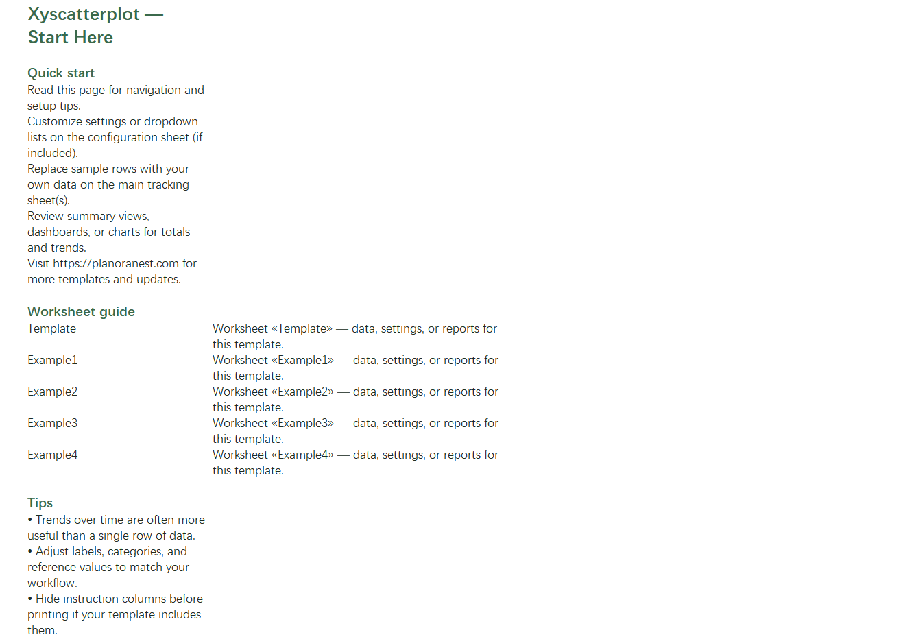
 Quick view
Vendor: PlanoNest
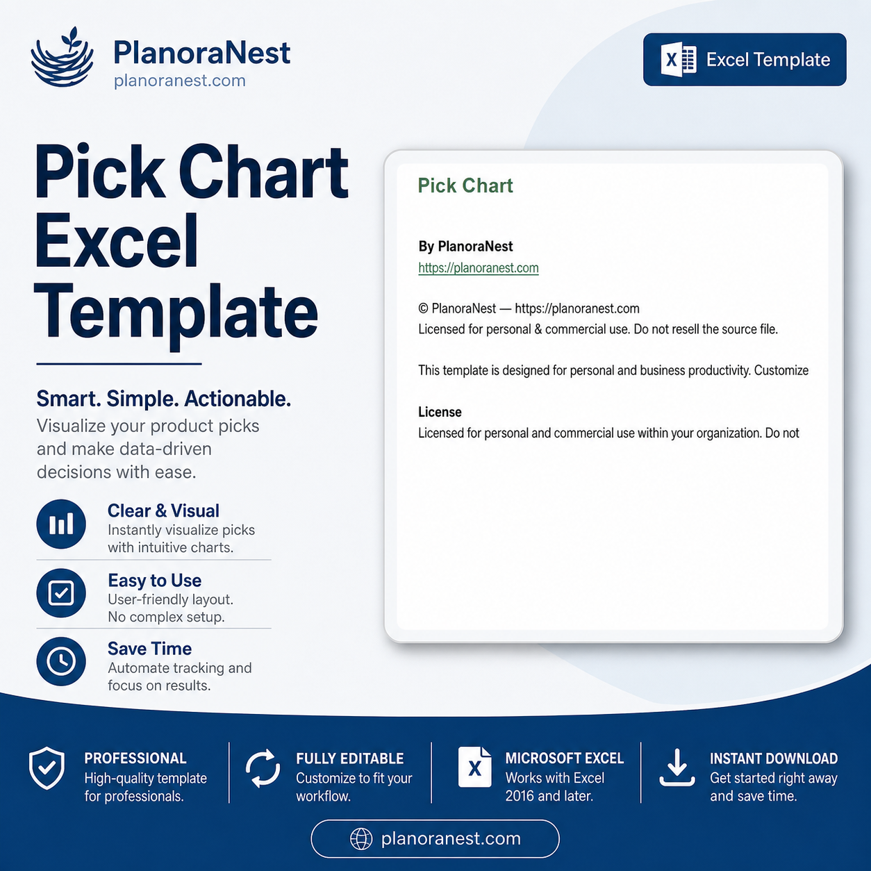
Pick Chart Excel Template | Pick Chart Template ExcelRegular price $6.90
Sale price $3.90
4.7 / 5.0 (3) total reviews

Vendor: PlanoNest
Regular price $6.90
Sale price $3.90
Excel
Quick sign in at checkout — your templates are saved to your library forever.
Related picks
Explore other digital products that pair well with this template.
Quick viewVendor: PlanoNest
Pick Chart Excel Template | Pick Chart Template ExcelRegular price $6.90
Sale price $3.90
 Quick view
Vendor: PlanoNest
Normal Distribution Curve Excel Template | PlanoraNest TemplateRegular price $6.90
Sale price $3.90
 Quick view
Vendor: PlanoNest
Pie Chart Excel Template | PlanoraNest TemplateRegular price $6.90
Sale price $3.90
 Quick view
Vendor: PlanoNest
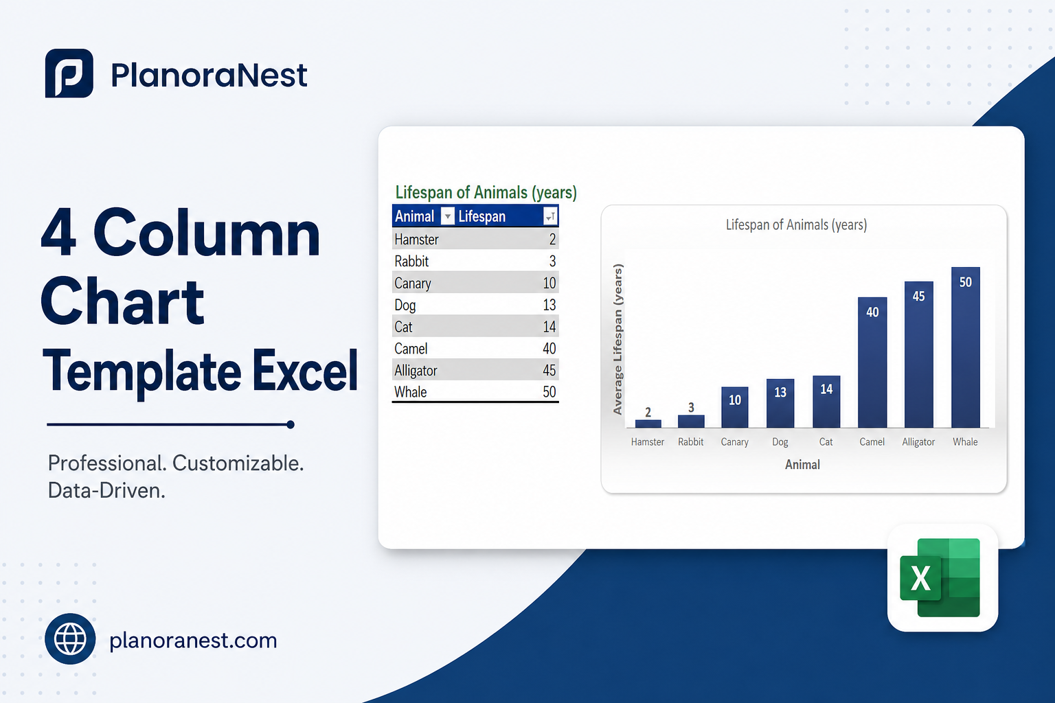
4 Column Chart Template Excel | PlanoraNest TemplateRegular price $6.90
Sale price $3.90
This excel xy scatter plot with standard deviation template from PlanoraNest gives you a ready-to-use Excel workbook for building professional XY scatter plots. Whether you are analyzing correlations, plotting scientific measurements, or visualizing the relationship between two variables, this template provides structured data layouts and multiple discipline-spanning examples.
Whether you search for excel xy scatter plot with standard error template or get xy formula on scatter plot excel, this file works in Excel, Google Sheets, WPS Office — one-time purchase at $3.9 (regularly $6.9), instant download, no subscription.
This XY scatter plot template is a strong fit for:
Scientists, engineers, and researchers plotting independent vs. dependent variable relationships.
Students and educators in biology, statistics, economics, or any field using regression and correlation analysis.
Data analysts who need to visualize bivariate data with trendlines and XY formulas.
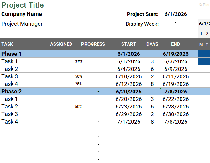
The file contains 7 sheets:
Sheet | What it does |
|---|---|
Start Here | Quick-start guide with worksheet overview and PlanoraNest brand colors. |
Template | Blank XY scatter plot layout with Independent Variable and Dependent Variable columns — 12 rows of sample coordinate data you can replace with your own X-Y pairs. |
Example1 | Douglas Fir and White Pine tree measurements — circumference (meters) vs. height (meters), showing two related datasets on one sheet for multi-series scatter comparison. |
Example2 | Adult Weight by Height — 9 data points pairing height (feet) with weight (pounds), a classic correlation dataset perfect for trendline and R-squared analysis. |
Example3 | Population vs. Size — 17 geographic regions with population figures and land area, ideal for large-value scatter plots and outlier identification. |
Example4 | Biology 101 Grades vs. Hours Studied — 17 student records pairing study hours with GPA, demonstrating education and behavioral correlation analysis. |
About | Template attribution and license. |
Independent/Dependent variable structure: Template uses clear X (Independent Variable) and Y (Dependent Variable) column headers so you know exactly where each axis data goes.
4 diverse examples: Forestry (tree dimensions), health science (weight vs. height), geography (population vs. area), and education (study hours vs. GPA) — each demonstrates a different correlation strength and use case.
Multi-series ready: Example1 shows two species (Douglas Fir and White Pine) on the same sheet, demonstrating how to set up multiple XY series for comparison.
Trendline and formula support: Add Excel trendlines to any example dataset to display the regression equation and R-squared value directly on your chart.
See how each sheet looks before you download — screenshots from the actual template.
Preview of Excel Xy Scatter Plot With Standard Deviation Template | PlanoraNest Template
Preview of Excel Xy Scatter Plot With Standard Deviation Template | PlanoraNest Template
Preview of Excel Xy Scatter Plot With Standard Deviation Template | PlanoraNest Template
Preview of Excel Xy Scatter Plot With Standard Deviation Template | PlanoraNest Template
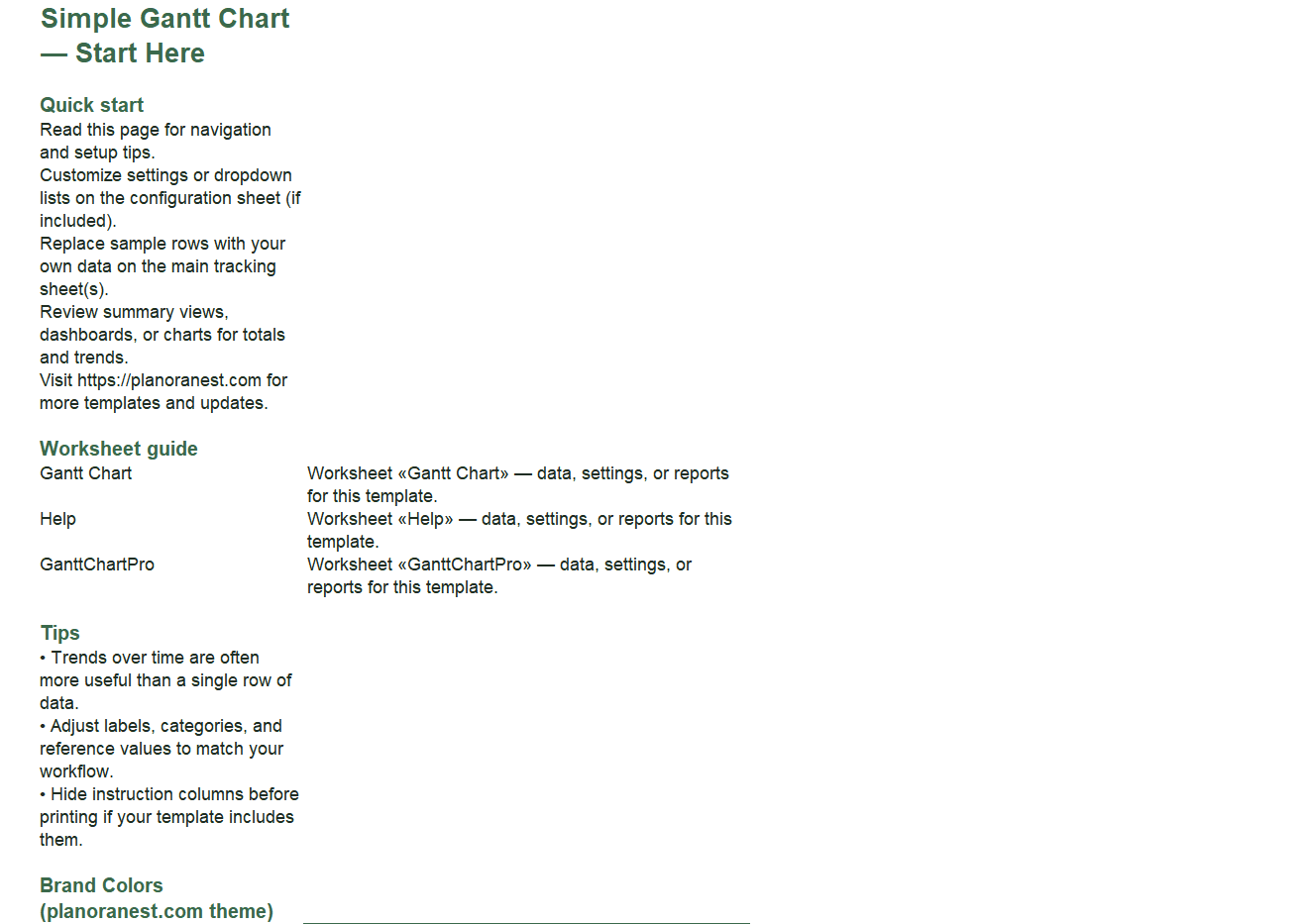
Open the Start Here sheet for a guided tour of all worksheets.
Go to the Template sheet. Enter your independent variable values in the first column and dependent variable values in the second column. Replace the default Title with your own chart title.
Select both data columns and go to Insert > Chart > Scatter (XY) in Excel. Choose the basic scatter style (markers only) or markers with smooth lines.
To add a trendline, click any data point on the chart, select Add Trendline, and check "Display Equation on chart" and "Display R-squared value" to get your XY formula.
Explore the 4 example sheets for different correlation patterns: positive (Example1 trees), moderate (Example2 weight/height), clustered (Example3 population), and weak/behavioral (Example4 study hours).
Microsoft Excel (desktop & web)
Google Sheets
WPS Office
LibreOffice Calc
One-time purchase · $3.9 USD (regularly $6.9) · Instant download · No account required to use the file after purchase.
1. Purchase
Browse our shop and pick the templates that fit your needs — from business planners to productivity trackers.
2. Access
Since our products are digital, you'll receive immediate access after your purchase completes.
3. Use
Open your template in Google Sheets, Excel, or Notion and start using it right away with our included instructions.
Marcus Webb
Small business owner
Verified purchaseGood foundation, wish it had built-in stats
I bought this to analyze the relationship between my ad spend and revenue across 12 months. The Template sheet's Independent/Dependent Variable layout is exactly right for this, and I had my scatter plot up in about 5 minutes. The 4 example sheets gave me confidence I was setting up correctly. My only wish is that the template included pre-built STDEV columns or error bar setup — you have to add those yourself. That said, for $3.9, the structure and examples alone are well worth it. I'll reuse this for other business metrics.
Jenna Alvarez
Operations coordinator
Verified purchaseBetter than free templates
I compared several free scatter plot templates before buying this one, and the difference is the example variety. Four completely different datasets (trees, body measurements, population geography, and education) meant I could see exactly which structure fit my logistics data. Ended up using the Template sheet with my delivery time vs. distance data, modeled after the Example2 weight/height format. Added a linear trendline and got a clean R-squared value for my quarterly ops report. Worth every penny.
Emily Hart
Teacher
Verified purchasePerfect for my statistics class
I teach high school statistics and needed clean datasets for students to practice scatter plots and correlation. This template delivers beautifully. The Example4 sheet (Biology grades vs. hours studied) was an instant hit — students immediately understood the X-Y relationship because the data is relatable. We also used Example1 (tree measurements) to demonstrate how to plot two series on one chart. Having the Template sheet meant students could then input their own survey data. At $3.9, this replaced two hours of lesson prep.